BLACKLINK
Branding
CHALLENGE
Crafting a distinctive logo and visual identity for Backlink, representing the platform’s mission to connect backpackers with diverse job opportunities across Australia.
GOAL
The primary goal was to design a logo that embodies the dynamic and efficient nature of Backlink’s recruitment platform, emphasizing its commitment to swiftly connecting backpackers with exciting job prospects. The secondary goal was to infuse the visual identity with a sense of friendliness and positivity, aligning with the promise of finding the perfect match within 48 hours.
BRAND’S CONCEPT
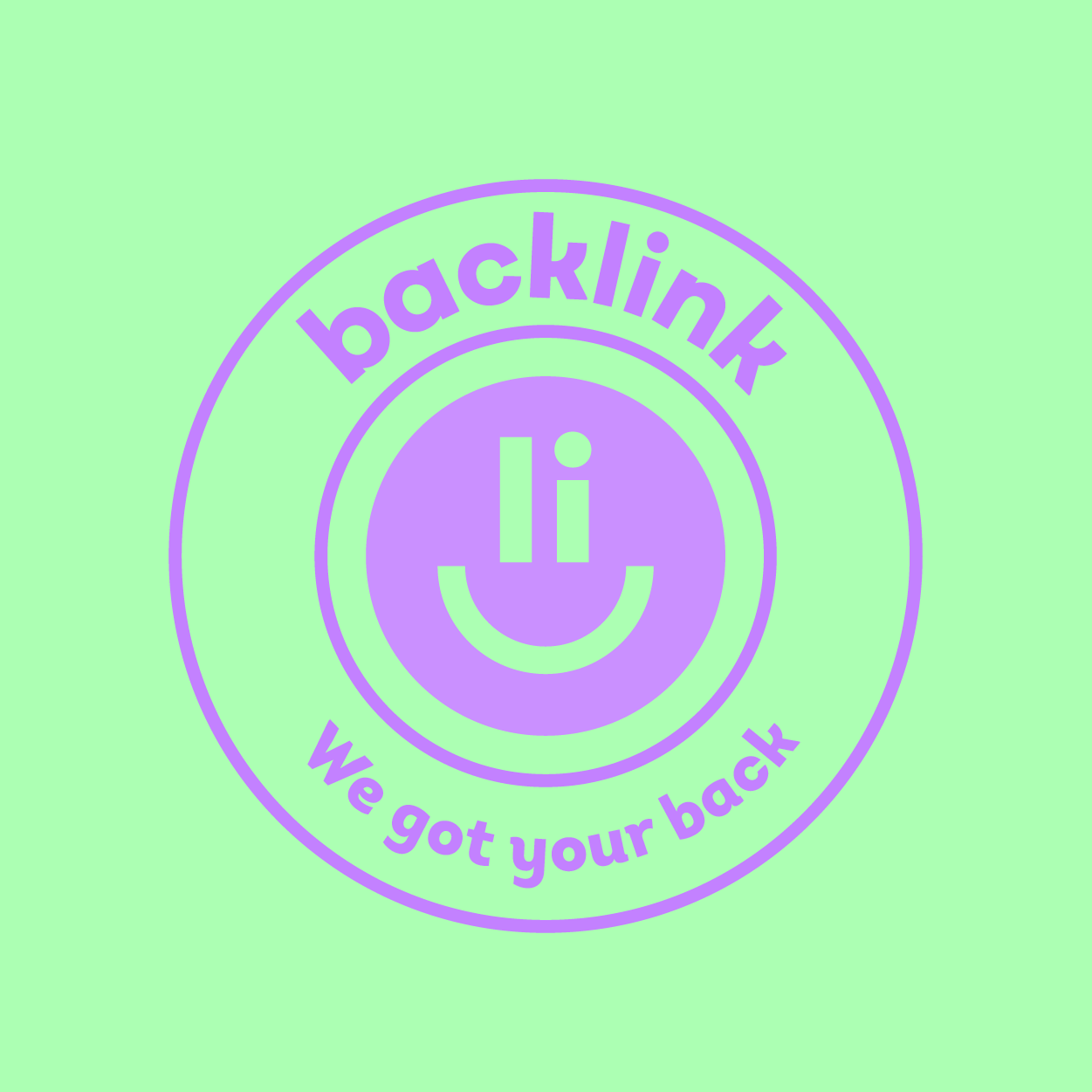
Backlink’s brand identity centers around its core values of efficiency, friendliness, and the joy of making connections. The visual elements aim to convey the platform’s dedication to quick and reliable recruitment services while maintaining a positive and approachable vibe. The incorporation of waves in the logo symbolizes the dynamic and fluid nature of connections, reflecting Backlink’s commitment to providing seamless linking between backpackers and job opportunities across Australia.
BLACKLINK ISMAGNETISM|CONNECTION|SPEED|BRILLIANCE
LOGO
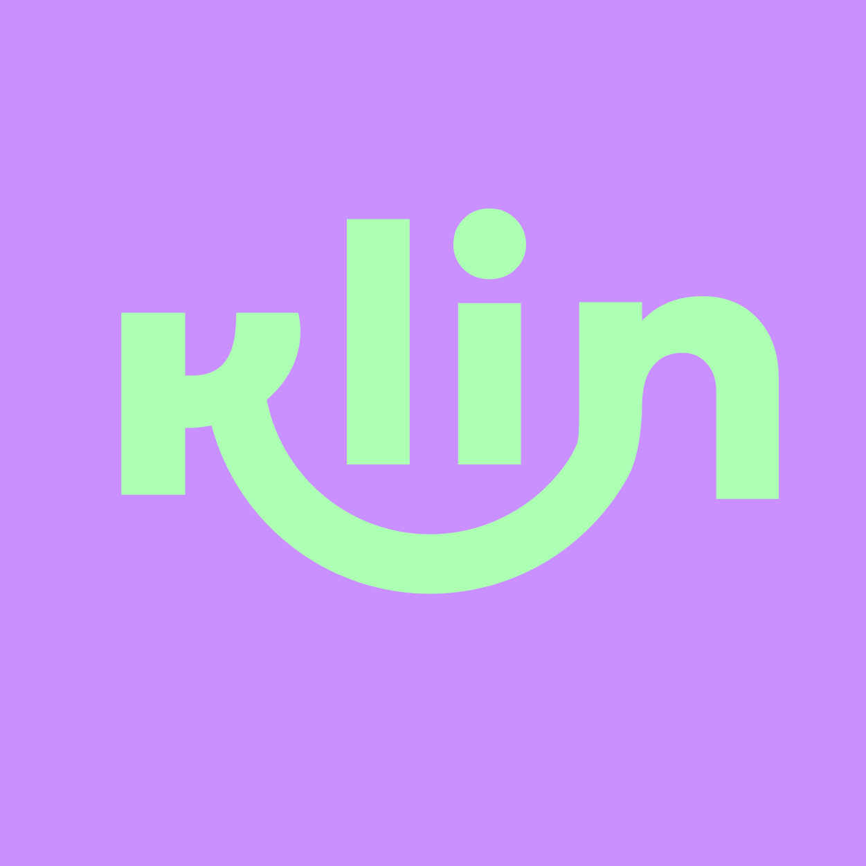
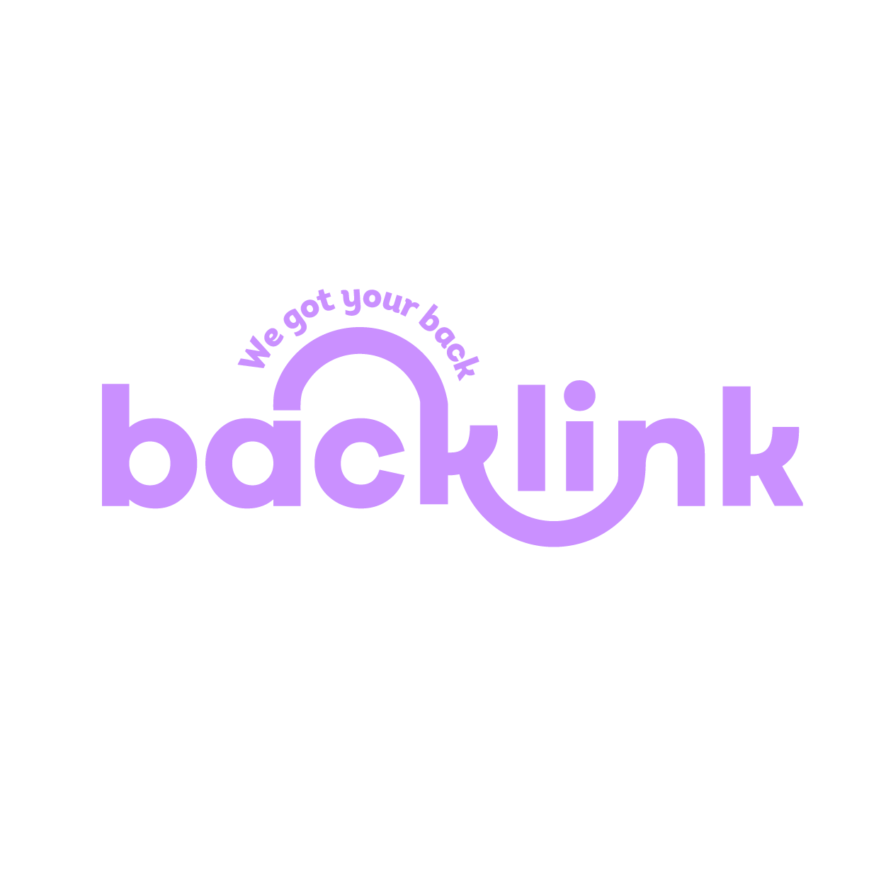
This logo is all about riding the waves of connection! Imagine the letter ‘K’ transforming into two waves—one forming a friendly smile underneath, and the other linking up on top. It’s like catching the perfect wave of positivity. The smile signifies the friendly vibe you bring, and the ‘K’ doubles as a link, symbolizing your knack for connecting people effortlessly. So, ride the wave, spread the good vibes, and make those connections effortlessly, just like your logo suggests!
LOGO VARIATIONS
