OUT FOR WANDER
Rebranding | Strategy | Web Design | Copywriting | UX/UI | Content Creation SM
WEB: outforwander.com
CHALLENGE
Total brand makeover. Balance the brand’s eclectic identity by creating more congruent visuals.
GOAL
Rebranding, brand book genesis, web redesign, content creation.

")
BRAND’S CONCEPT
Our mission is to create transformative experiences for travelers by seamlessly blending art, nature, and movement. We envision a world where travel is not just about sightseeing, but also a transformative journey of self-discovery, cultural understanding, and sustainable impact.
OUT FOR WANDER ISCONNECTION|RESPECT|DIVERSITY|CURIOSITY


LOGO
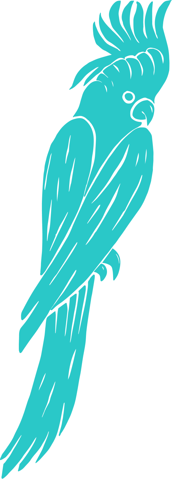
Initially it featured a bird taking flight surrounded by nature’s elements, but upon receiving it, we realized that the colors and gradients were a little tacky and did not convey what OFW truly represents. In terms of design, it did have some semblance of harmony, so we used it as a starting point and spruced it up from there. As for the typography, it felt very childish so we dialed up the scribe’s age in order to maintain the handwritten vibe.
The overall aesthetic was kept, preserving the rustic and human aspect of the brand, but we gave it a sleeker look. Our main focus throughout the rebranding process was on establishing a more cohesive color palette. After several iterations, we found a suitable gradient that depicted the brand’s eclectic nature, energy, and joyful vibe.
LOGO VARIATIONS


When it came to creating more logo options we chose to play with the brand’s initials. This design offers a useful alternative for smaller placements of the logo, where the main one’s details would be lost. The typography was drawn from the main logo with the aim to preserve the brand’s essence.

BRAND APPLICATION


")
